Data Storytelling: Analytics Dashboards Built in Laravel
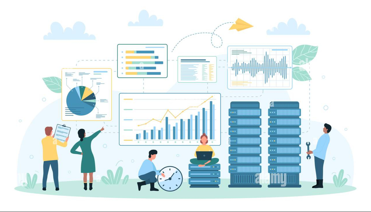
Excellent dashboards do more than simply display a ton of information; they provide a straightforward account of the state of your company or product. You already have the building elements to convert raw analytics into decisions if Laravel is part of your stack. A useful playbook for organizing, creating, and growing a data storytelling experience with a Laravel dashboard is provided below. It makes use of everyday technologies that teams in the United States (and a small percentage of users in India) use.
What “story” means in a Laravel dashboard
A good Laravel analytics setup answers three questions in order:
- What’s happening?
- Why is it happening?
- What should we do next?
Let's start with the narrative. Start by creating a KPI dashboard with the three outcomes—revenue, adoption, and support load—that are most important to your audience. Every KPI should have a deeper view that shows the supporting context (segments, trends, and anomalies).
Core stack that works in production
Laravel ships with a lot you can use out of the box:
- Eloquent models for a clean data layer (include scopes for date ranges and segments).
- Policies and Gates for Access control based on roles so the right people see the right numbers.
- Queues with AWS SQS or Redis for background jobs that prepare aggregates on a schedule.
- Broadcasting for a real-time dashboard when a live counter or alert matters.
- Laravel Horizon for queue visibility when you batch-refresh metrics.
On the UI side, two patterns are popular and well-supported:
- Livewire components for server-first interactivity without a heavy SPA build.
- Inertia.js, if you prefer Vue or React, while still using Laravel routing.
For charts, most teams reach for Chart.js or ApexCharts. Both handle area, bar, line, and pie charts well, and they plug into Blade, Livewire, or Inertia with minimal glue code.
Admin scaffolding can save weeks: Laravel Nova and Filament admin both offer resource management, metrics cards, and filters you can extend for custom reporting.
Data modeling for clarity, not just speed
Design tables and aggregates around questions, not just events. Keep your event data normalized (e.g., “page_view,” “signup,” “purchase”), then create nightly or hourly rollups with queued jobs into summary tables like daily_signups, mrr_by_plan, or tickets_by_channel. These summary tables make pages load fast and keep charts simple.
You can safely compute aggregates using window functions (Postgres) or grouped summaries (MySQL) if your application uses either MySQL or PostgreSQL. Add indexes for common filters (date, user_id, plan_id) and consider partial indexes for frequent segments such as “active,” “churned,” or “trial.”
To prevent drift, use Redis for hot counters (such as "active users right now") and periodically write those counts back to SQL.
For hot counters (such as "active users right now"), utilize Redis. To prevent drift, occasionally write those counts back to SQL. That mix—Redis cache for speed plus relational storage for truth—keeps the story accurate and the UI snappy.
Practical chart choices that help tell the story
- Use a line chart for trends (new users, revenue). Pair it with a small table of top segments.
- Use a bar chart to compare categories (plans, channels, regions).
- Use a stacked bar only when the stack parts are stable; otherwise, it gets hard to read.
- Use a single number card for “north-star” metrics and pair it with a sparkline.
Both Chart.js and ApexCharts support annotations—vertical markers for releases, campaigns, or outages. Annotating a timeline is a simple way to connect cause and effect without adding another chart.
Filters and segments that people use
Keep filters few and obvious: date range, product plan, region, lifecycle stage. Preload “quick picks” like Today, Last 7 Days, Last 30 Days, and This Quarter. When a filter changes, update both charts and text summaries in the header so the story stays consistent.
If you support customers in North America and India, consider default time zones by user profile. U.S. teams often prefer ET or PT; Indian teams use IST. Aligning the date boundary to the viewer avoids “off-by-one day” confusion on daily charts.
Security, privacy, and compliance basics
Protect the dashboard like you protect production data. Log access to sensitive reports, mask PII in exports, and enforce role-based access control at the controller and policy levels. Support SAML or OpenID Connect if you provide SSO so that business clients can centrally manage permissions. Maintain audit trails for metric modifications; display a changelog in the user interface whenever a formula or definition is modified.
Performance playbook
- Cache expensive queries (e.g., month-over-month revenue) with tags so you can invalidate by date range or entity.
- Run scheduled jobs to refresh summary tables during off-peak hours.
- Paginate tables and lazy-load charts below the fold.
- Profile your app with Laravel Telescope locally and Blackfire or Tideways in staging.
- Use database read replicas if you’re handling large reporting workloads.
A common approach is a double-write pattern: raw events stream to SQL for reliability and to Redis for quick counters. Then, hourly jobs consolidate the events into summary tables. Your charts read from summaries; your drill-downs read from raw tables.
Content and copy inside the dashboard
Small, human sentences matter. A card that reads “New signups: 1,248 (↑12% vs last 7 days)” tells a clearer story than a raw number. Add short explanations beside complex charts: “These are paid users by plan; totals exclude canceled trials.” A little text helps non-technical teammates understand the context without asking an analyst for help.
Shipping the first version
Scope the first release to one KPI dashboard and two drill-downs. Pick one metric each for acquisition, activation, and retention. Wire it in Blade with Livewire components or ship an SPA shell with Inertia.js. Start with Chart.js for visuals since it’s lightweight and simple to theme; if you require more complex interactions, like zooming or mixed series, switch to ApexCharts.
If you want a head start, scaffold resources in Laravel Nova or Filament admin and drop custom metric cards for your summaries. You can style these to match your brand later; accuracy and speed to value come first.
SEO quick wins for the blog or docs section that promotes your dashboard
If you’re publishing case studies, API docs, or release notes about your reporting features, include high-intent phrases people search for. Here are examples you can use naturally in headings and paragraphs (and in image alt text). Make sure they align with your content and audience:
- Laravel dashboard
- Laravel analytics
- data storytelling
- real-time dashboard
- KPI dashboard
- Chart.js
- ApexCharts
- Laravel Nova
- Filament admin
- Livewire components
- Inertia.js
- MySQL
- PostgreSQL
- Redis cache
- AWS SQS
- Access control based on roles
Titles (H1/H2), meta descriptions, the first 100 words, as well as at least one subheading are all excellent places to use these terms. Add internal links from the product websites to your technical guides and use short slugs (e.g., /laravel-dashboard-setup). Include screenshots of U.S. currency and imperial dates (MM/DD/YYYY) for the American audience; for Indian readers, include a footnote or toggle mentioning IST and ₹.
Maintenance and iteration
Metrics evolve. Add a small “Definition” icon to each KPI that opens a drawer with a plain-English explanation, SQL source, and last update time. Keep a public changelog in your docs so teams trust the numbers. When a number changes because the definition changed, show a banner: “Active users exclude staff accounts as of Sept 1.”
Run a monthly review with product, success, and finance. Ask: Are the charts answering the questions we care about today? What felt confusing? Which filters were ignored? Make use of those insights to enhance copy, add missing segments, and retire low-value charts.
Final Thoughts
For an excellent data storytelling experience in a Laravel dashboard, clarity, context, and trust are more crucial than dazzling visuals. With Eloquent for queries, AWS SQS or Redis for queues for background work, Chart.js or ApexCharts for fast visualizations, and security features like role-based access control, you can construct reports that people use every day. Start with a tight KPI dashboard, annotate important events, and keep definitions transparent. The story your data tells will become part of how your team makes choices—one clear chart at a time.
Do you enjoy reading this blog? Then please have a look at our blogs as well. Please do not hesitate to contact us if you have any questions. We are here to assist you! Check to visit our website to learn more about us and our services.